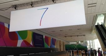
It doesn’t take a genius to see an uncanny resemblance between the “7” and “X” banners hanging around Moscone West in anticipation of WWDC. Yet somehow everyone is crazily focused on iOS 7, when Apple also has a next-gen OS X to show us today.
In fact, we seem to be quite sure of what iOS 7 will bring to the table. So sure that we even have mockups floating around claiming to show what the mobile OS looks like.
Since iOS 7 is already a given, why not tackle that minimalistic X sign Apple is flashing around Moscone West? What could it stand for?
The two banners bear a striking similarity from a design standpoint. Both the 7 and the X have been painted so thin you can barely see them for the dots (in the case of iOS) and the agitated sea (in the case of OS X).
If that doesn’t suggest OS X 10.9 will be just as flat as iOS 7, I don’t know what does.

 14 DAY TRIAL //